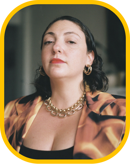

Fer Cozzi and Katja Schimmel discuss the latest type trends in branding.
From explorations beyond “the convention” to a desire for Cooper Black: Fer Cozzi and Katja Schimmel talk about current type trends they see in branding and their dreams for the future of type usage.
Can you describe your journey into type design? What initially sparked your interest in this field?

Fer: I got into graphic design in the university because I’ve always been obsessed with letters, plain and simple. I mean, I wanted to be a type designer before I even knew it was a real job.
Back in my teenage years, my friends and I were all about graffiti and tagging. Spray cans and markers really influenced how I saw letters. Then, college happened, and that’s where my true love for typography kicked in. Thanks to some amazing teachers, calligraphy classes, and typography events, I was hooked. I became a full-on type fanatic.
After finishing my graphic design degree, I jumped straight into a Type Design specialization at the University of Buenos Aires. Everything just clicked there: theories, techniques, the whole mindset around letters … pure happiness. I can’t picture myself doing anything else now.
Katja: During my apprenticeship as a media designer, I developed an interest in typography. This led me to apply to Bauhaus University in Weimar, where I explored various fields in the visual arts.
Later, my journey took me to the Netherlands. The TypeMedia program at the KABK in The Hague gave me the opportunity for a deep dive into type design. After graduation, I gained insight into the technical side of type design during an internship as a font engineer at Alphabet Type in Berlin.
I am currently working at Grilli Type on various tasks, including initial design concepts, drawing, refining, and mastering typefaces. I am also focused on improving workflows and building a knowledge base to support both our team and the type design community.

What are some of your favorite typefaces, and how have they influenced your work?

Fer: Being an old lady who has seen countless typefaces (haha), I find it hard to pick just a few favorites. More than any one typeface, I’m much more intrigued by the collective work of a designer. That’s because I believe it gives me a more complete vision of their way of thinking.
In that sense, the work of Oldrich Menhart, Zuzana Licko and W. A. Dwiggins are my top three favorites. They are more than just a few typefaces here and there, more than just pretty forms. Each, in their own way, constructed a way of doing and thinking, even beyond the discipline.
I think I can say that my “favorite typefaces” are really a collection of worldviews that influence me. Maybe not so much in the shapes of the letters, but in the desire for my work to explore some aspect of “making letters.”
It’s not about drawing for the sake of drawing, but about trying to push an idea somewhere, even if the result might not be commercially attractive, trendy or functional.
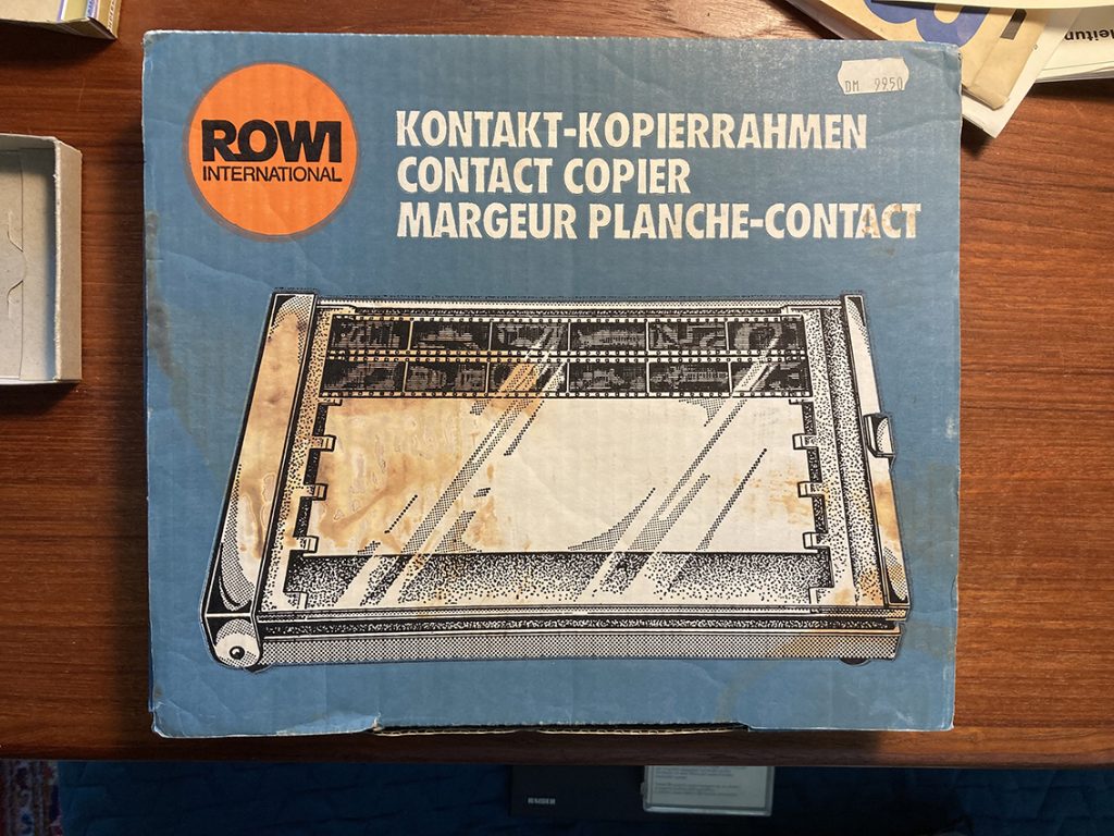
Katja: It’s hard to pick a favourite, because my preferences shift from day to day. For inspiration I take a lot of pictures or screenshots whenever I find something fun or interesting.
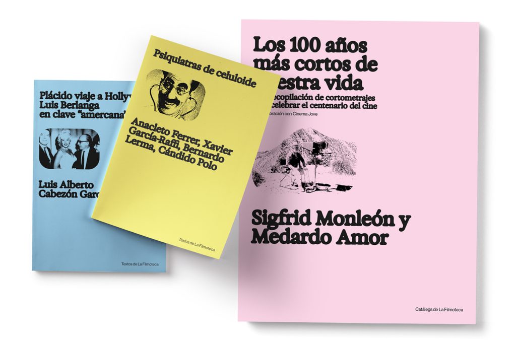
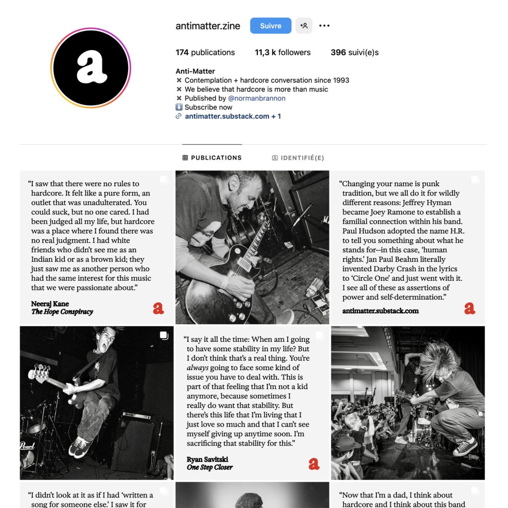
So here is a small peek into my type pics.


What current trends in type design do you find exciting or promising?

Fer: I think nowadays there’s a stronger willingness to explore things beyond “the convention.” I’m interested in the growth of a trend towards expressive typefaces (not necessarily crazy, weird or experimental), but ones that express something. Moving away from the pursuit of false neutrality, seeking voices, stances, challenging the expected while embracing history.
Creating expressive typefaces isn’t about deliberately thinking of making something “experimental,” but about truly having a more personal process. Letters are signs of their time, loaded with details from their context and the perspective of the one drawing them. The big life-changing moment is when you realize that each person and project is unique, and it’s better to avoid trying to be or copy someone else’s work. We all have to draw the same letters because the shapes of the letters are what they are, but we can give them flavor with our own recipe.
I believe typography today has endless possibilities, and it’s vital to maintain curiosity beyond tangible results and references within the discipline. One must feel constantly ignorant just to avoid falling behind. New things are being generated all the time, within the discipline and its surroundings. And, as in any creative field, standing still is moving backward.
Katja: There’s an increasing recognition of the need for typefaces that accommodate various digital environments and the needs of a variety of readers. Type can react to different sized displays with a range of resolutions, ambient lighting, distance of the viewer from the screen and other external conditions. Simple tweaks, like opening up counter shapes, increasing the x-height or wide letter spacing, can enhance readability for small sizes. While specific design adjustments, like an increased letter width, can aid low-vision readers.
With variable fonts, expressive styles can coexist with optically adjusted ones in the same font file, allowing for individual use. I recommend to read this and this.

What is the process for designing a custom typeface for a client? What are challenges and difficulties, for example the implementation across a big organization?

Fer: The process usually involves a lot of talking—both with the client and with the team working on the identity design. It’s about listening beyond the brief, understanding what is meant when certain things or words are said, asking them to show what they’re looking at, what they like, or even better, what they don’t like.
For me, designing is like having a big –almost endless– conversation. Creating a custom project means entering into a dialogue with someone else who thinks, looks, and has ideas that might be very different from what I would come up with on my own.
It’s important to listen and accept feedback, trying to understand rather than believing we have the absolute truth. Letters belong to all of humanity, and everyone can have an opinion, whether we like it or not. I don’t think letters are the exclusive domain of type designers; we have specific technical knowledge, but if someone says, “The ‘e’ looks very playful,” I don’t need to take it badly or dismiss the comment just because it isn’t in academic vocabulary. On the contrary, it’s important to ask more, try to see what the other person sees.
The challenge is working with humility and not with hermetism. It’s also about making things simple, understanding the expected use, the type of client, and the application capabilities. In other words, where that typeface will live.
There’s no point in filling the project with things that come more from the designer’s desire to show off than from the actual needs of the project. It’s time and effort that quickly becomes obsolete and leads to frustration, hahahaha.
And the other key point, at least for me, is that once the typeface is out in the world, it’s no longer mine and I have to let it go. It will be used as people see fit, and I can’t control that. They might adjust the spacing or tighten everything, distort it, not use the OpenType features… and that’s okay. Letting go means understanding that fonts are a tool like any other, not a work of art just meant to be admired.
Katja: The first step for designing a custom typeface is understanding the clients requirements. For example the environment the fonts will be used in and which styles they might need. After setting this design space the initial research and first sketches are done to find a fitting design direction. Most of the time the client can chose from multiple directions. At this stage it’s important to clarify which details influence the perception of the typeface. For example the size of the counters, the angle of the terminals, the x-height, or the size, weight and length of serifs etc.
Once a direction is set it’s time to refine the design. A key challenge at this stage is providing beta fonts to the client regularly and motivating them to test them in their planned environment and give feedback.
The last phase is then mastering and production. This involves expanding the character set to support different languages, kerning, hinting, and testing the typeface on various platforms. Finally, we reach the most enjoyable part: the final release. It’s very rewarding to see the typeface fully implemented and in use.
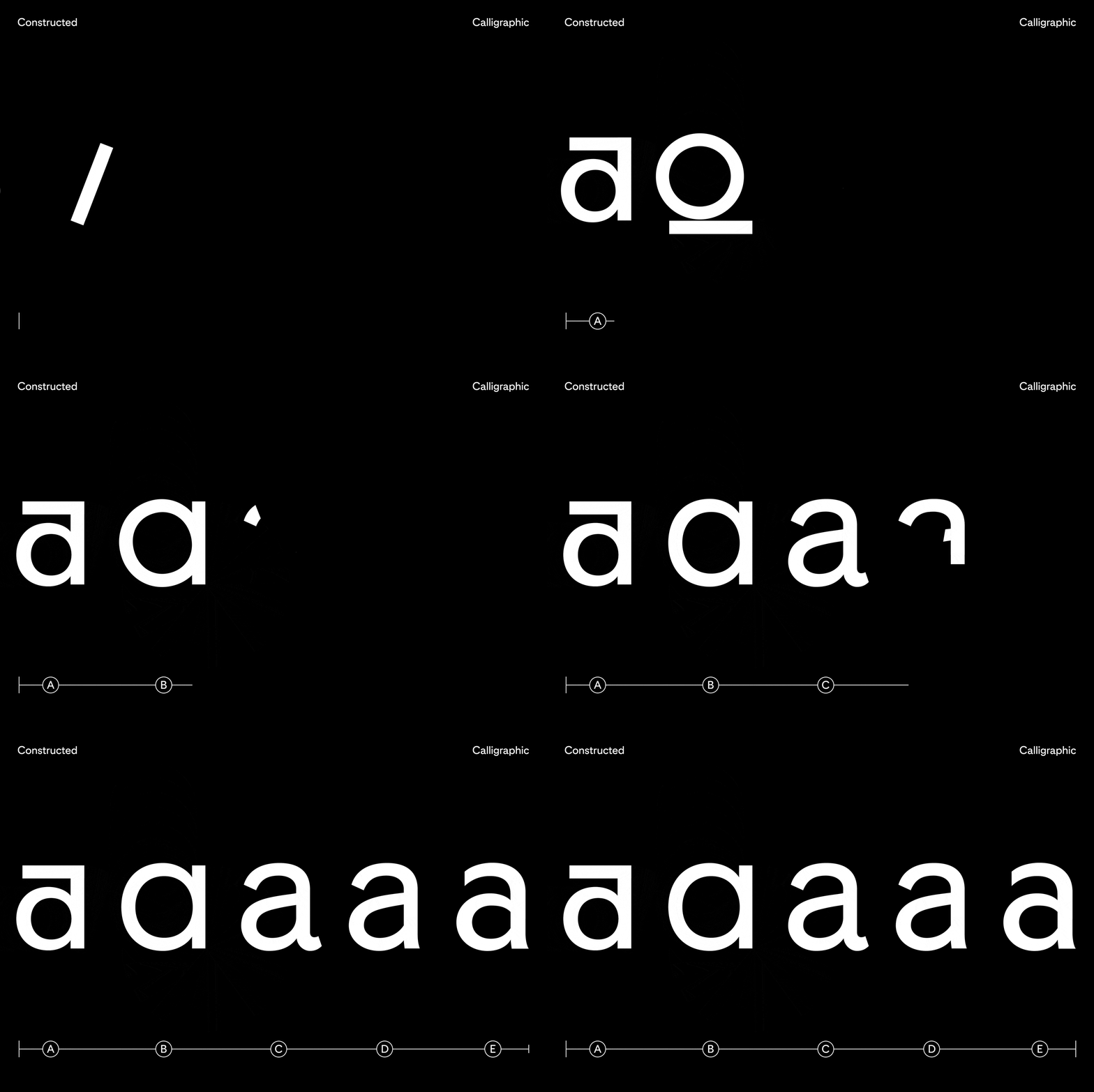
A great example for a typical commission project is Pinterest.

What role do you think variable fonts will play in the future of brand design and visual identities?

Fer: I believe that variable fonts are a tool, a format, that could be useful in the future for addressing certain technical issues. However, if they only serve to replace having multiple font files with a single one, I see it as merely a format advancement. If variable technology is only used to range from thin to heavy or condensed to expanded, for example, I don’t think it changes the role of variable fonts compared to static fonts.
What’s important is to start thinking about what possibilities it offers us, and how we can use them to develop a design that leverages the technology to propose something unique, a differential, a concept, an idea. Like any tool or technology, it should be used to create, to push limits, and to emerge from what seems on the brink of breaking. We should explore the creative possibilities it provides, rather than just using it because it’s possible to do so.
I don’t know if I have a specific project in mind, but I really enjoy seeing Federico Parra’s Exposure typeface. It combines a beautiful design with a great concept and effective use of variable font technology, resulting in a typeface that gives a unique identity to any project because of how distinctive it is. It’s a perfect illustration of how variable fonts can go beyond mere functionality and contribute to a memorable and impactful design.

What reason would you use to convince a client to go with a variable font, although they are skeptical?

Fer: I would try to convince them by highlighting the flexibility and versatility of variable font technology. Variable fonts allow for a wide range of styles, providing a unique and tailored experience that better fits different contexts or design needs. It also offers creative freedom to adjust details as you use them, while still ensuring consistency across various applications.
From a technological standpoint, the performance benefits are significant: they reduce file size and make storage and web usage more efficient. This can lead to faster load times and an improved user experience.
Finally, using a variable font can demonstrate an interest in modern and innovative processes, projecting a forward-thinking image and a commitment to cutting-edge solutions. And at the end, we all want to be cool, right?
Katja: I believe variable fonts will play a significant role in the future of brand design and visual identities.
As branding increasingly transitions into the digital realm, variable fonts demonstrate unique advantages. These fonts offer flexibility and adaptability, allowing designers to create responsive and dynamic typography that can adjust seamlessly across different devices and screen sizes.
While not every client may need a variable font, there are compelling reasons to consider one, especially if the project involves multiple styles. Variable fonts offer the advantage of interpolation, allowing for seamless transitions between styles. This means everything can be compressed into one file, not only reducing file size but also simplifying font management.
Moreover, variable fonts open up new design possibilities, providing a dynamic range of expressions within a single font. A variable font lets you utilise an entire spectrum between stylistic extremes, offering more flexibility and creativity.

What is a trend you would love to see coming back from typedesign (70's/80's/90's)?

Fer: I want less legibility and more fun—EMIGRE, PLEASE COME BACK! Hahaha. I’m craving more excitement and less simplicity. Bring on the eclectic pop style of the ’90s; let’s ditch the seriousness and minimalism.
If Marie Kondo gave up on order, why shouldn’t we give up on synthesis?
Seriously though, I’d love to see designers making more decisions based on ideas rather than just technical solutions. Just because a tool lets you do something doesn’t mean you have to. Just because we can have 50 weights in a family doesn’t mean we need them all. Similarly, just because we can use components for consistency doesn’t mean we should achieve it only by replicating parts. Having a typeface with a grotesque R, a humanist R, and a middle-ground R doesn’t mean we need to do it to “give more decision power to the user.”
I’m yearning for a return to a more artisanal, bold, and whimsical design. More intricate and provocative. Typefaces that are the way they are because the designer wanted them that way.
But hey, let’s stop being so “pick me” and be more like “if you don’t like it, there are plenty more out there.” Tyranny? Maybe … hahaha.
Katja: Bring back Cooper Black!


